In Praise of a Quiet Buildings

Entry of the Norton Simon Museum washed in soft light from the skylight above.

Entry of the Norton Simon Museum washed in soft light from the skylight above.


The Norton Simon Museum in Pasadena, would not be on most people’s list of great buildings. That being said the quiet, understated building is a fantastic place to view art or spend a day amongst art for all the reasons that make a building great. The quality of the light, the scale of the spaces, the way the building interacts with its site all combine to create an pleasant experience. Pleasant is often a word that implies faint praise, but what makes the Norton Simon and buildings like it worthy of emulation is the way we can in inhabit them and let the architecture recede into the background.

The Norton Simon was built in 1969 by the firm ofLadd + Kelsey. Walther Hopps,  the curator drew up a short list of local architectsincluding  Richard NeutraCharles EamesJohn LautnerCraig Ellwood, and Thornton Ladd.(Wikipedia/ William Poundstone (September 4, 2012), How the Norton Simon Got Its Curves Blouin Artinfo.) Then in 1995 Frank Gehry and Associates did a renovation.

Today one the most notable things about the Norton Simon is that the building itself is hard to see. The lush landscaping has begun to obscure the structure. The parking lots in front of the building is heavily planted with Eucalyptus streets and terraced so the parking the lot feels less like a sea of asphalt and more like orchard. Even the main walk to the entrance of the Museum has trees planted in the walk. Our attention is also drawn from the actual building to the large bronze sculptures (Barbara Hepworth and and Henry Moore) The simply glass doors of the entry flow out to the sculpturegarden beyond and a pool of light. Gehry’s renovation created a series of skylights that pool light in the middle of the rooms softly enhancing the cellular nature of the rooms that flow from space to space. Down one long hall a large mural by Sam Francis. Soft light washes through openings out to the garden.

The intimate nature of the doors and skylights washing natural light from outside to inside not only helps orient us within the sequence of rooms, but add to the sense of intimacy. Rather than a huge institutional warehouse of art where we can get lost in the enormity of the building, the Norton Simon’s series of pavilions feel like we are wandering through a series of living rooms. This sense of scale is translated out to garden with a shallow serpentine pool of lilly’s reminiscent of Monet’s garden transplanted to  California. The meandering path with a number of sculptures by Noguchi, Moore, Brancusi;  and blooming plants timed years round filter the noise from the nearby freeway.

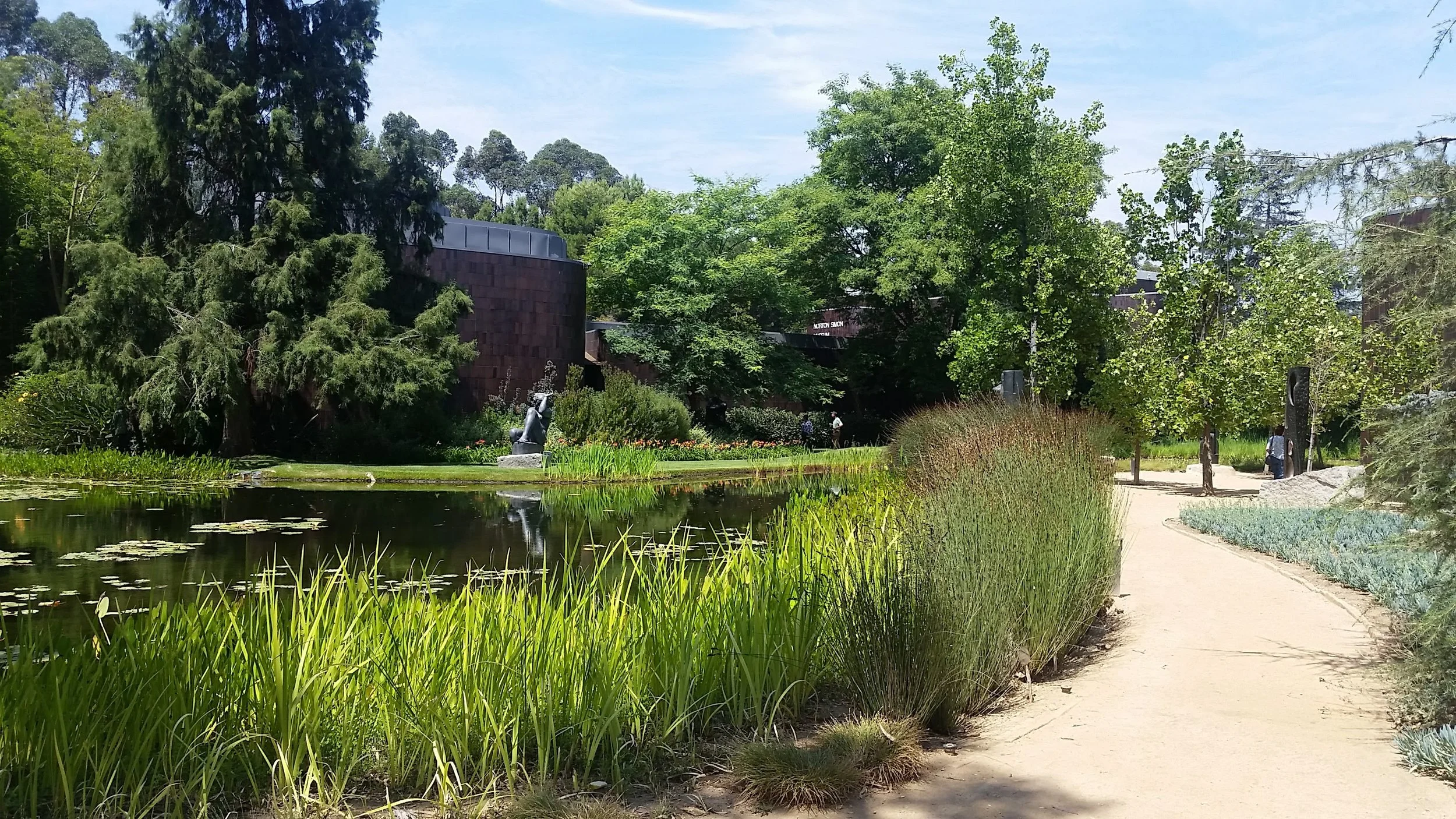
From the exterior I wouldn’t praise the massing or the form of the Norton Simon. The lack of noticable windows is slightly problematic in so much it doesn’t invite us in or allow us to interact with the building, but this isn’t about the experience from the street. In reality, where it counts meaning a place to see art the Norton Simon is a strangely human building.

Reflections on Japan One: Revisiting

I have just come back from my seventh trip to Japan.

On my first trip I was frantically trying to document everything because I thought it was a once in a lifetime trip. Most of us tend to explore the world as if we get one chance at bat. We visit a place and check it off our list. What I have learned from Japan, is the joy in going back to a place.

Going back frees one from the rush to see everything. It opens up the possibility of being lazy. Spending a day wandering, eating and sitting in a cafe. Sometimes revisiting a place, or a shop or deciding not to visit that historical site because there is no rush!

On our first trip, we were in Kyoto looking for a place to eat. We came upon small shopping mall, tucked behind an older building. That night there was some sort of bridal promotion so the steps to the second and third floor were decorated like a brides train.

Each time we went back we would try to find that place again.

The entrance before being torn down

The entrance before being torn down

This year, it was gone.  The mall was torn down and a temporary parking lot remained. It was sad and yet invigorating. One our next trip to Japan, I am excited to discover what has been built in its place.

Light as Space

Above the Ark, skylight and glow from windows

Above the Ark, skylight and glow from windows

Mike was the Owner's Representative for the Beth-El Temple Renovation in Belmont, MA.  He worked closely with Bob Luchetti, the Architect, in creating a sensitive and respectful renovation to the worship space.  One of the aspects that Bob understood intuitively was that the space would not only be transformed or activated by light, but the space was the light.

At a recent service, this became very present as the light entered the space through the stained glass windows and hit all the surfaces.  The light not only glowed, but reflected the stained glass to become spatial. 

We think that Bob must have known intuitively that the space would undergo this transformation through reflectivity through the detailing, colors, and careful insertion of design elements such as the wood eyebrows above the stained glass to catch light and reflect more surface.  This careful attention to detail is a great example of how to stitch a room together with architectural elements that use light as the binder.

Something Old


We often are asked to venture to buildings and places that are abandoned and in need of some love.  One recent building that we visited has been abandoned for many years and filled us with wonder and possibility.  We see a lot of beauty in the bones that are left behind, these images share some of what we discovered.

Thinking About Urbanism


FACT:  Most Americans don’t grow up or live in urban conditions despite the fact that Los Angeles, Houston, Phoenix, San Antonio, San Diego and San Jose are on the list of the most populous cities in the US. Of course, millions of Americans reside in these cities, but the rest inhabit the bedroom communities that have led us to be called A Nation of Suburbs.

PROBLEM!  There are misconceptions and disconnects that Americans have in understanding spatial possibility in the suburban and urban realm. As designers of public space (Architects, Urban Designers, Landscape Architects), we need to recognize this blind spot and embrace the patterns, rhythms and nature of urban space in the deepest cores of our thinking and making.

DEFINITION: What do we mean by urban space? It is not the romanticized images of grand European cities that float in the collective American conscious. Urban space is a dense layering of dualities: landscape and building + people and place. In reality, urban space is complex, fluid and stratified. The individual parts of the environments that make up these dualities are hyper-connected to the point where their beginnings and endings merge into ONE: landscape-urbanism-architecture. This seamless connection of space is a quality exemplified in the most populous cities of the world – places like Shanghai, Mumbai, Seoul or San Paulo.  

SOLUTION? American designers need to understand, challenge and overcome the following existing issues when creating urban space:

(1)  Americans privilege architecture as a discrete object/form rather than as a blurred and complex series of linked spaces which transition from public to private.

(2)    There is a lack of understanding of site as a broader ecosystem of inputs that transcend a Google map or an assessor’s lot line. This simplistic and often diagrammatic view of site and landscape is nurtured in the strip malls and front lawns that divide our landscape like picket fences.

(3)    We are limited by our complicated idealization of “urban” which comes from media/Hollywood films and results in an association of the urban condition as a complex racial and economic formula, often confused with violence and intimidation.

The only way to get to a point of real comprehension of urban space is by direct observation and participation, what the German philosophers call Erlebnis. It is through only through this kind of unmediated knowledge – the act of experience, that we can counter and challenge the issues at hand and begin to design better urban space.

POTENTIAL!  We believe that through an immersion into urban life through engaged acts like derives or city wanderings, we can start to understand the urban as the same as landscape. Despite differences in scale, the spatial continuities of the built environment in our cities are the same as natural forms like canyons and caves in our landscape. Landscape and Urbanism are ONE.  

Reflections on Walker Art Center Minneapolis


A few months ago, I was in Minneapolis. One of the places I was very interested in visitingwas the Walker Art Center. The Walker Art Center was originally designed by Edward Larrabee Barnes (1971), with an addition in 1985 by Herzog & de Meuron. Generally, the architecture community speaks favorably about the Walker, but my experience was very disappointing. As I walked around the complex I kept thinking, this is an example of how architect's fail us even in the midst of moments of beauty. 

Possibly my reaction came because I walked to the Walker. I didn't rent a car and had an appointment earlier in the day about a half-mile from the museum. It was a pleasant sunny October day so I walked through a pretty residential area and across a major six lane road and arrived ... or had I? The Walker sits at the corner of an intersection with the sculpture park on one side and the museum itself on the other. Right at the corner is sort of an open plaza. I say "sort of" because there is nothing connected to the wide flat space. If you walk a couple hundred yards along the flat plinth, there is an entrance to the Herzog & de Meuron addition or you can go around the corner to the main entry off the original Barnes Building. However at the corner is just this empty space. Both the horizontal and vertical surfaces are glazed plum colored brinks, some wide low stairs that mediate the topography and ratty grass. The steps are buckling and seem to be in disrepair. The is no signage, nothing to mitigate the scale. No direction to either entry. 

Empty plaza at the corner, no sign of an entry.

Empty plaza at the corner, no sign of an entry.

Walking route

Walking route

Walking to the Herzog & de Meuron entry, I was struck by the reflection in the glass doors. It was a reflection of highway signs – the major road an entry ramp to the highway – so as I walked towards entry of the building it felt like I was entering the highway.